
Mid-Century Kitchen Remodel — How to Honor Great Design in an Upgrade
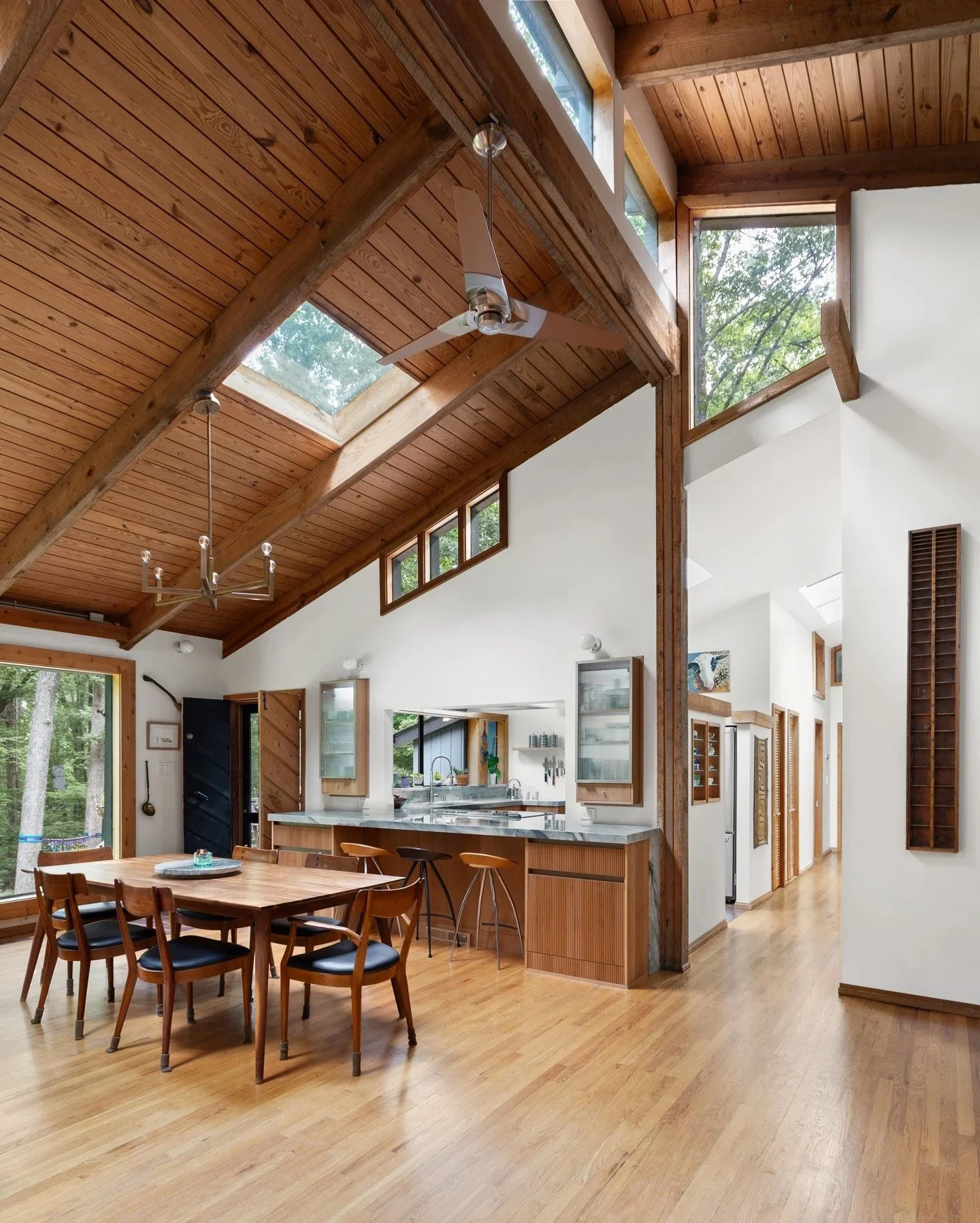
Project showcased in Chapel Hill Magazine
This architecturally designed mid-century home had many beautiful elements already in place but the kitchen had not been updated since 1978 and was falling apart. The large family living in the home needed more storage, but changing the footprint of the kitchen was not possible without compromising the rest of the architecture. So the problem to solve was both how to honor the existing architecture while also making the space more functional. Read More…
“Bronwyn helped me design the unique place that I had envisioned. Her ideas, expertise, and creativity took and improved on my concepts and turned them into reality. I highly recommend her for any project that you have in mind.” — Joe Patterson
Recording Studio & ADU — How to Do a Lot With a Little

AWARD WINNING PROJECT
Project Featured in Durham Magazine
Designed for a local musician and recording artist, this space needed to serve multiple uses: as a recording studio, performance venue, and a guest suite/ADU. The budget for this project was very limited, and the building had to fit in the back corner of a residential urban lot in Durham, North Carolina. Every day this building is visible to the clients from their bedroom, kitchen, and back deck, so it was important that the building was nice to look at and not too big. The clients wanted to be able to invite large groups to see performances by local artists & musicians in a fun and relaxed atmosphere, while also preserving as much of their backyard as possible for their child to play in during the day. Read More…
A House in the View - How to Play Nice with Nature

Located on a rocky outcrop in the San Juan Islands in Washington State, a key problem for this project was how to design a home that contributed to the beauty of the site rather than detracted from it. The lot is at the peak of a gentle hill and is highly visible from the water and land. In addition, the lot width was narrow and had significant setbacks leaving a small available building area. In order to fit the client’s desired program it seemed at first that the building would have to be two stories, but this would have created a tower-like form on the site which would overpower the gentle sweep of boulders and grasses that make the site so special.
We preserved the drama of the rocky coastline by first working to deeply understand the client’s goals that informed their programmatic desires. Through this exercise we saw an opportunity to reduce the scope of the program by using our spatial ingenuity to design a plan with no wasted space and a clever system of flexible rooms. This allowed us to keep the design to a single story.
Huge window-walls in key view areas create an intimate connection to the landscape. Reclaimed wood tongue-and-groove siding was allowed to gray out, melding with the surrounding natural palette so that the house feels like a part of the landscape rather than distinct from it. Simple, low cost interiors capture the aesthetic of the client’s Japanese heritage while maintaining the strict budget. This is an elegant, understated home; a place in which to connect with beauty outside its walls.
Fashion Guru’s Minimalist Kitchen — How to Turn Dark & Pokey Into Bright & Clean

Designed for two prominent members of the fashion industry in Seattle, this high-end kitchen remodel transformed a dowdy, dark 1980’s galley kitchen into a fashion-forward space that caters to their love of hosting.
Connecting the hosting spaces of the kitchen and living room required a complete reconfiguration of the kitchen layout. We eliminated a dividing wall, replacing it with a deep island that contains cabinets on either side for ample storage but connects the cooks in the kitchen to their guests.
We worked with mass as a visual language to create rhythmic harmony and clean lines, concealing all appliances inside cabinetry and using routed-in recessed finger pulls on cabinetry doors. This allows light to spill uninterrupted over the countertops from the large new window. A light color countertop was chosen to reflect this natural light around the room.
The clients wanted space to display art objects as well as an environment that was free of visual clutter. We integrated open steel shelving at the corner of the island where art can be best seen from the stairs by arriving guests. Visual calm was achieved by staining the 1980’s cherry-red floor a dark color to offset the tonal palette and carefully integrating small details such as flush outlets in the backsplash.
Mid-Century House Remodel — Small Space, Small Budget, Big Impact
Screened Porch & Deck — Privacy on a Small Urban Lot

The client for this Durham, North Carolina project wanted a naturalistic respite in the middle of urban life. But this small, urban lot with neighbors close on either side didn’t lend itself easily to privacy.
Instead of making the screen porch parallel to the house we rotated it 30 degrees to focus the long, open edge to the most verdant part of the lot. A deck for grilling on joins the screen porch to the house.
Partially screened sides block prying eyes from the neighbors on either side, but allow light and air to enter the screened porch. Shou Sugi Ban, the siding on this project, is a charred wood product that celebrates the natural texture of wood while being more pest & decay resistant than regular wood siding. Thermory ash decking is a thermally modified wood product that has a long life and requires no maintenance. Fine carpentry details elevate this simple structure.

This tiny, simply built mid-WWII house suffered from years of neglect and decay. Everything inside and some of the outside needed to be rebuilt including many concealed items (such as plumbing and wiring). The majority of the limited budget for this project had to be allocated to these necessary updates leaving very little for elevated interiors.
Celebrating the remaining mid-century features was a key part of preserving the character of this small home. Space-efficient storage solutions were devised to make this 750 sf home livable for a modern couple. We used reclaimed, worm-eaten wood dredged up from the Seattle Sound to create characterful floating shelving. The kitchen has custom-built white oak cabinetry with a slate countertop reclaimed from an old pool table. A light-toned bathroom with a curving hexagonal tile wall & floating vanity helps the small space feel larger.
Historic Addition & Remodel - How to Play Nicely with Historical Homes

A large, modern addition transforms a humble Sears kit-house located in a historic district while remaining connected to the landscape. Chapel Hill, North Carolina.
Historic Home Addition — Aging in Place in Style

Designed for an 85 year old owner who wished to age in his home, this addition provided a bedroom, bathroom and laundry facilities on the main floor, with additional space below for rental income. This addition went through Chapel Hill’s Historic District Commission review, stormwater stream buffer review, and was engineered for the steep slope. Chapel Hill, North Carolina.
Rail Station to Winery — Historic Mixed Use Conversion
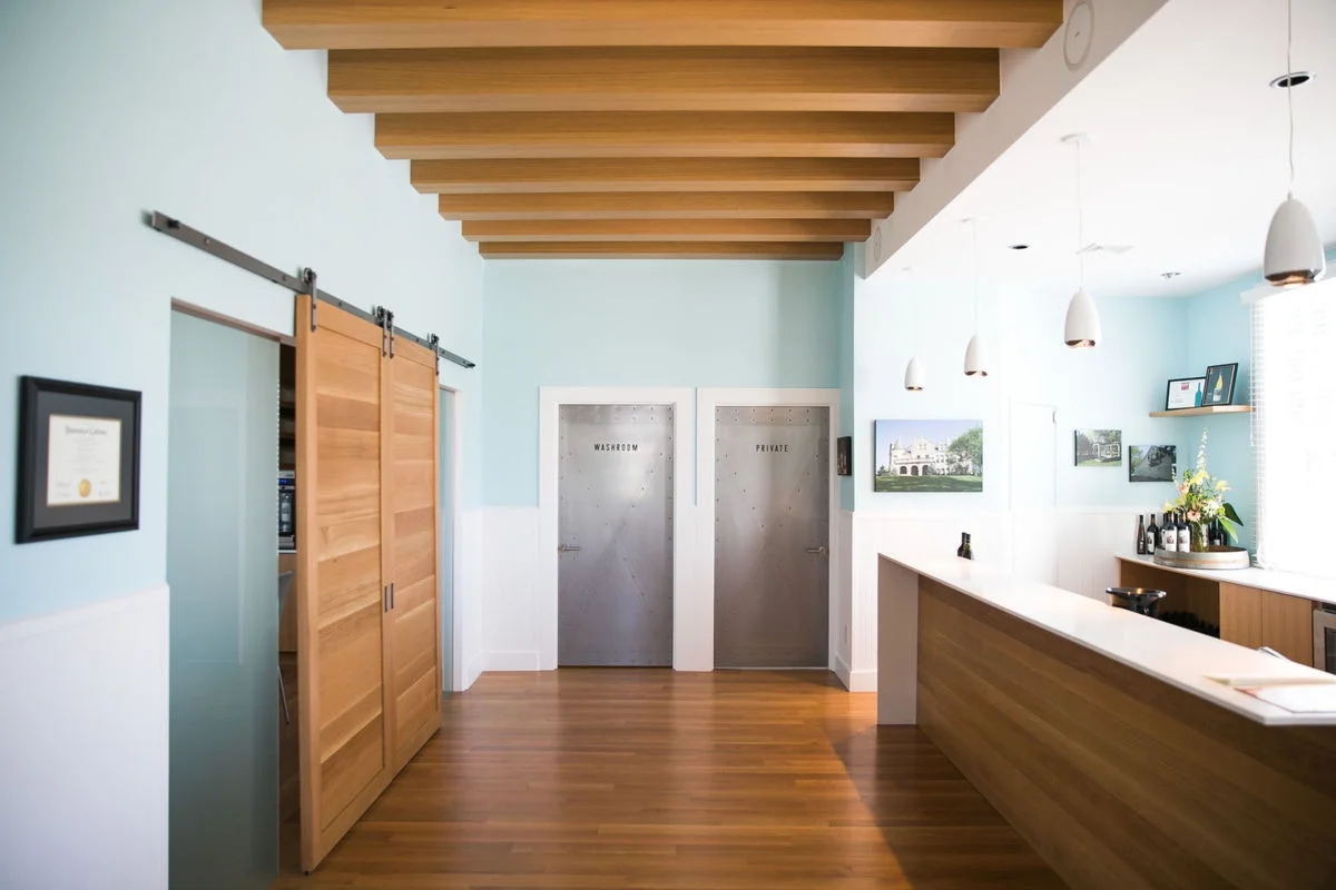
A repurposed railway station gets a facelift with spatial changes to bring in natural light and a palette of white oak and stainless steel. An event space, conditioned wine display and wine storage, a catering kitchen and offices were included. Charming turn-of-the century details are melded with industrial modernism. Eastern Washington State.

Downtown Seattle Restaurant Bistro

Sound view roof deck & summer kitchen. Seattle, Washington.

Seattle Cluster Housing Community
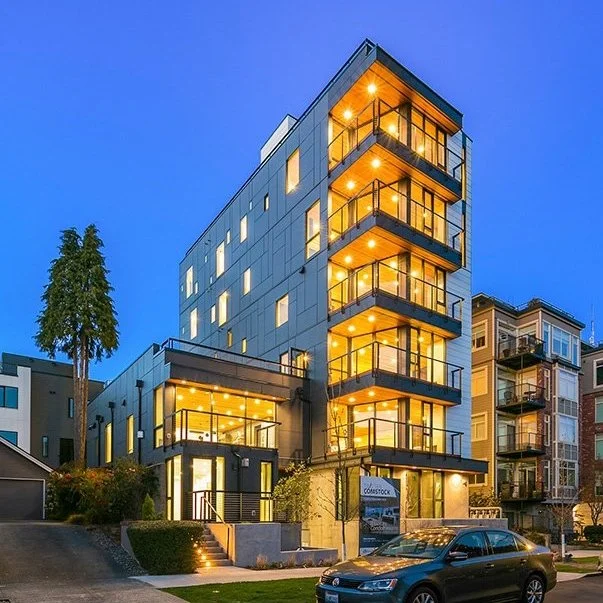
Queen Anne Condo Building

Seattle Mixed Use Residential and Commercial Space
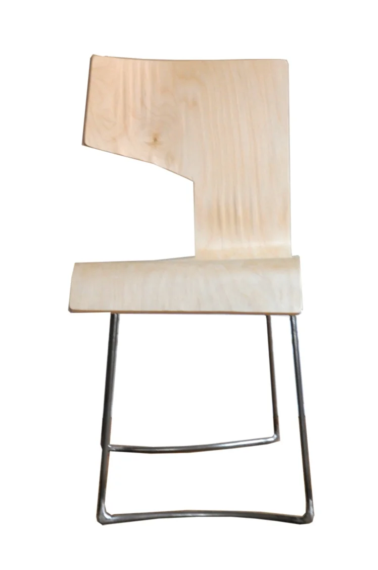
One-Cut Chair Prototype

Sukkah City Competition

Energy Incubator Concept

Aquatic Research Institute Concept

Railway Park Design

Waterfront Park & Urban Garden Concept